

Those Deaths Weren’t Taylor’s Fault, Maybe
A defense against the Harvard Medical School claims about Taylor Swift, Drake, et al. Plus: a movie to avoid, mixed assessments of AI on wellbeing, and everyone’s favorite: more lit review methods!

Happy April!
First off, if you’re only reading this interested in the title story1 of the newsletter, you may want to just search for “Taylor Swift” in this newsletter and jump forward to that section. It’s a big chunk of this month’s newsletter and is robustly footnoted2 to argue that there’s insufficient evidence to prove that Ms. Swift is responsible for the documented fatalities. This newsletter is primarily designed to help everyday folks use media more mindfully, though, and to that purpose it will cover a range of academic paper summaries that you are of course welcome to skim.
Any readers upset about misdirection are encouraged to post on social media about how mad you are, linking this post so others can be mad with you. (A sense of shared social presence through media can be a driver of wellbeing, as researchers in Shandong, Shanghai and Iowa City demonstrated in papers #1 and #6 covered in this newsletter below.) If that’s not enough, consider becoming a paid subscriber to send me premium hatemail3, though even unpaid subscribers get these “healthy media research summaries” each month for free!
For everyone else, some newsletter logistics: a core goal of mine this year is to try to build a community around researchers of media and wellbeing, which means I’ve created a new section just for these literature reviews under the label of “The Good, The Bad and the Monthly” -- so if you’re not particularly interested in this as a topic, you can unselect this section in your settings and you’ll still get general posts from me.
But let’s dig into some recent45 papers! I’m going to start by walking through some methodology6 of how the papers are selected, sharing some high-level observations about “wellbeing and media” as a general topic of research.
Some readers may feel like they need explicit permission to choose-your-own-adventure, so…
Paper Overview
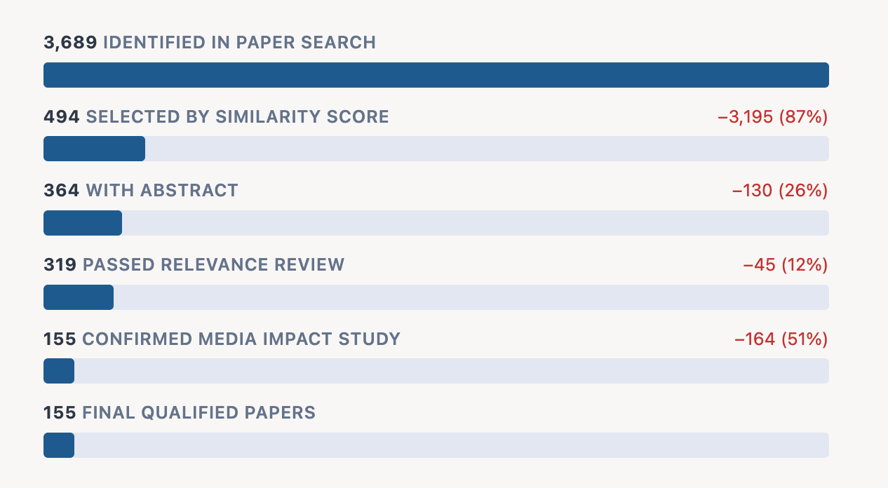
As discussed last month, the process I’m using here has stages -- first identifying papers that match the boolean query “media OR wellbeing”, then filtering for the highest semantic score matches, removing papers without abstracts and completing a three-part agentic review. There were 3,896 papers identified this February and, of those, 155 qualified for analysis -- selected as examining the impact of media (as an independent variable) on wellbeing (as a dependent variable).
Of these 155 qualifiers, 65 observed positive effects of some kind and 89 observed negative effects. (One paper, a lit review in the American Journal of Education and Technology, found that social media “is neither uniformly harmful nor beneficial”.)
Part of what I like about this approach of keeping up on papers is that the authors cover a wider range geographically than I would come across in a more organic method.
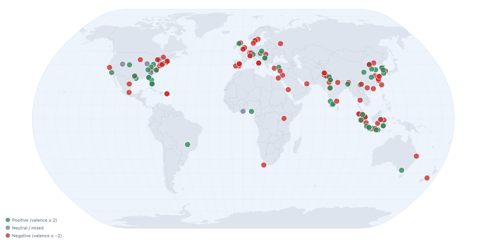
Just scanning the map, a few curiosities pop out to me.
Within the US, it does seem like the liberal northeast is more likely to publish about harms of media whereas the interior of the country seems to publish about its benefits.
Europe also seems more likely to publish on this topic, with Western Europe’s research generally more critical of media’s effects than Eastern Europe’s.
Indonesia publishes so much about this topic -- both in total output and on a per capita basis. (Three papers in today’s digest come from Indonesia.) Indonesia does not overindex on wellbeing papers in other categories I monitor, so this trend is notable, and I hope to investigate it further.
There are considerably fewer publications from Africa and South America than we would expect given their population size.
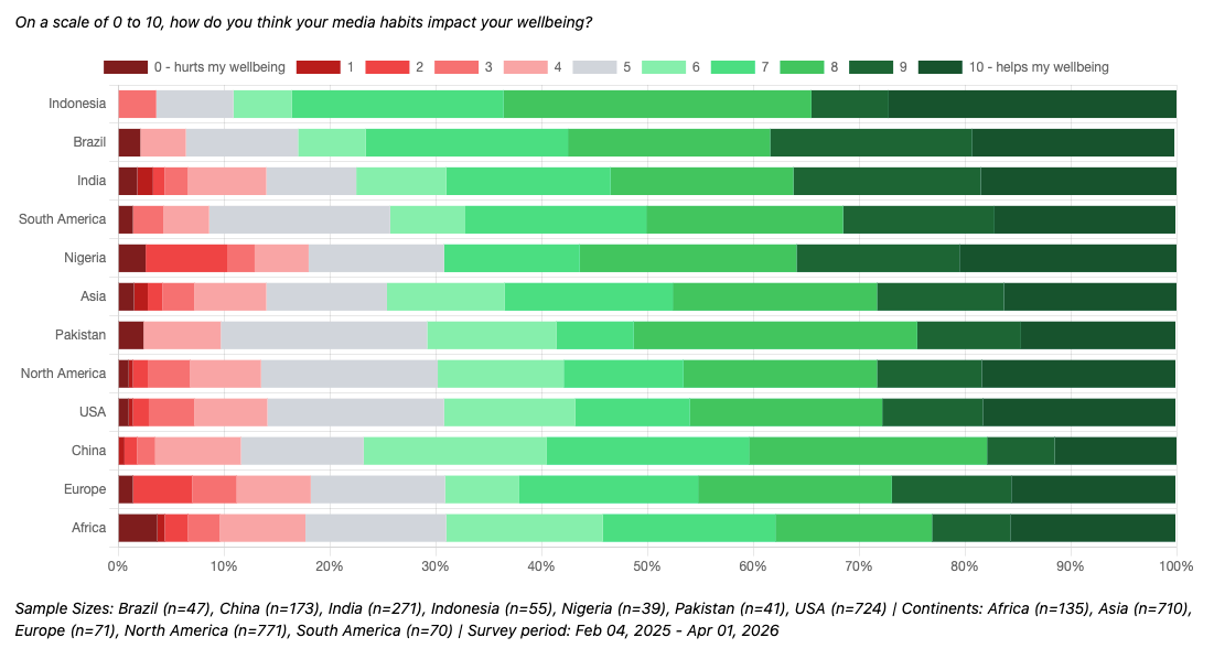
This general trend of media-critical papers coming out of the US and Europe aligns somewhat with responses from a question I ask in the Mic Check Media Daily Global Omnibus7. Here we find that residents of Europe and the USA are among the regions where residents are most likely to believe that their media habits hurt their wellbeing.
Topic-wise, “social media” remains a frequent focus for these studies -- over half of the studies identified make it their target, 80 of the 155 identified papers. Of those 80, nearly four in five (77.5%) identify negative effects, ranging from FoMO, burnout, reduced physical activity, addiction, problematic use, reduced self-esteem and more. On the positive side, some studies found social media encouraging help-seeking, improving mood, increasing interest, increasing informedness and reducing stigmas.
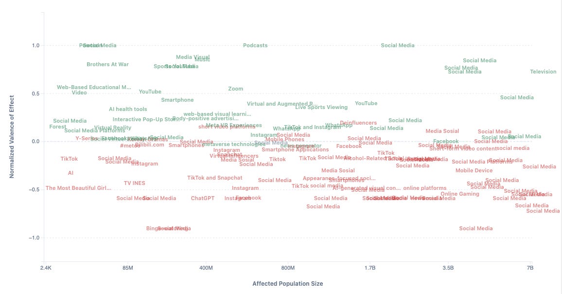
I’m working on some new ways to visualize the social media results in particular, and to make it easier to understand the specific operationalizations examined, but for now you can note how social media dominates the “large affected population size” of my platform/effect chart.
Enough about methodology -- let’s dig into some of my favorite papers from the month!
What’s Good and Bad in Media Research: February 2026
Rather than having separate “good” and “bad” sections as I did last month, I’m experimenting with a back-and-forth flow -- hopefully this doesn’t leave readers with such a depressing vibe by ending with a parade of horribles. We’ll both start and end on positives!
Good: Podcasts!
In a survey of young adults, Shandong University’s Weiwei Li found that not only is listening to podcasts correlated with higher wellbeing, but that the mechanism at play is that podcasts create a greater sense of social presence and social support. I know podcasts help my wellbeing personally, and I think I can see Li’s model at work in my own listening habits -- connecting me with fellow listeners as well as generally keeping me company.
The paper is peppered with open-ended responses trumpeting appreciation for podcasts and the communities they create. Though the specific programs they mention are different from those we have in the US, I think the same principles likely apply here!
Full paper: “Podcast Listening, Perceived Social Presence, Perceived Social Support, and Subjective Well-Being Among Chinese Young Adults: Sequential Explanatory Mixed Methods Study”8
Bad: ChatGPT!
Researcher Arwa H. Arab, in Jeddah, Saudi Arabia, found that more time using ChatGPT was predictive of depression in a regression analysis of survey data from 200 students at King Abdulaziz University. Interestingly, though, a question about “comfort discussing mental health with ChatGPT” predicted lower levels of depression and lower levels of anxiety, suggesting a range of possible relationships between AI and wellbeing -- potentially driven by different user characteristics or usage patterns.9
Good: Mental Health Media Guidelines
The World Health Organization released specific media guidelines in 2023 to prevent deaths potentially attributable to media coverage. A team of researchers across the US, Canada and Australia reviewed 15 studies across 11 countries that examined the impact of similar media guideline efforts, finding that these government-led initiatives significantly increased compliance with best practices.
While the study didn’t demonstrate that these guidelines save lives, the authors suggest this is because only 3 studies in their meta-analysis included death rates. Their literature review, though, is persuasive in referencing other papers that have demonstrated the impact of media coverage on death rates. As such, I’m personally inclined to believe in their broader wellbeing impact.
Full paper: “Impact of Media Guidelines on Sxxxide-Related Reporting Quality and Sxxxides.”10
Bad: The Netflix Film “The Most Beautiful Girl in the World”!
In Surabaya, Nancy Anggita and Ade Kusuma conducted a set of interviews to find that the Indonesian rom-com The Most Beautiful Girl in the World can reinforce beauty standards for viewers.
Specifically, they conducted long-form, open-ended interviews with media professionals and analyzed them with a framework called Stuart-Hall Reception Theory (SHRT). This approach classifies “readings” of a film as either dominant, negotiated or oppositional, based on whether what is understood from a film is aligned with the intended/mainstream message.11 They found that nearly all interviewees (4 out of 5) accepted or partially accepted the beauty myth ideology the researchers identified in the film (“dominant” and “negotiated” reading positions), with only one interviewee taking a critical view (or “oppositional” reading position).
I probably would have preferred a larger sample size with a more structured survey instrument, because I have many more questions. What film characteristics are most conducive to oppositional readings? And what viewer characteristics drive dominant, negotiated and oppositional readings? Ultimately, though, I enjoyed seeing a theoretical tool applied in an empirical setting, and I’ll make sure to not watch The Most Beautiful Girl in the World!12
Full paper: “Penerimaan Pekerja Media terhadap Mitos Kecantikan pada Film The Most Beautiful Girl in the World di Netflix”13
Good: “Deinfluencers”!
A study by Florida Gulf Coast University researchers Gina A. Tran, Youngok Sunny Song and Khaled Aboulnasr explores a subset of anti-consumption content creators (whom they call “deinfluencers”) that are effective in shaping anti-consumption attitudes within their audiences.14 (Or that’s what the abstract says; the results and discussion are paywalled!15)
I wanted to point this paper out anyway because I’ve worked on many, many ad effectiveness studies as a market researcher, and this might be the first “reverse ad effectiveness study” I’ve seen, and if the conclusions truly are supported by their data and methodology, it shows the design of our media system can shape our values and beliefs about consumption.
Full paper [paywall]: “Power to the deinfluencers: how parasocial relationships drive anti-consumption among young consumers”
Bad: Smartphones!
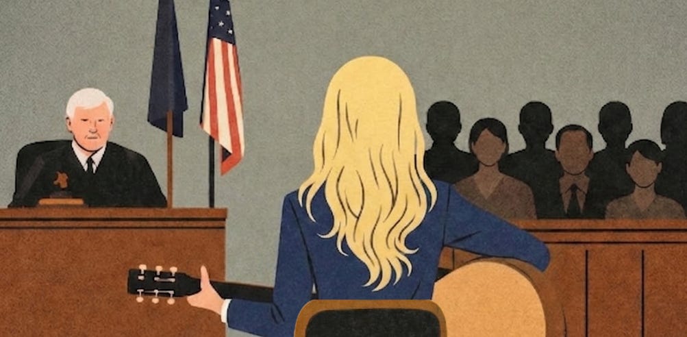
For those searching for it: “Taylor Swift”!
A Harvard Medical School paper making the rounds is media catnip because it could implicate Taylor Swift in the deaths of 500+16 people over the past decade. More generally, though, it found that the release of major, highly publicized albums on streaming services is correlated with an increase in traffic fatalities. The findings suggest that using smartphones to play music while driving is a serious public health concern worthy of deeper consideration. There’s honestly a lot that is interesting in this paper, so I’m going to spend a bit more time with it.
The methodology focuses on the “Top 10 Most Streamed Albums in a Single Day from 2017 through 2022”, which in addition to the 3 Taylor Swift albums includes 2.5 Drake albums as well as albums from Bad Bunny, Kendrick Lamar17, Harry Styles and Kanye West. This quasi-experimental design is very cool, but there are a couple of reasons why I think we can’t attribute traffic fatalities to any particular artist. And in describing these reasons, it is my hope to deliver on the promise of my clickbait headline and exonerate these artists from all suspicion.18
“I Look in[to] People’s Windows[’ Effects on P-Values]”
(Or: “[Publication Incentive Impact on Academic] Paper [Postu]Rings”)19
The crown jewel statistic of the paper is a p-value of 0.01 when comparing album release days to non-album release days, suggesting that it is extremely unlikely this effect is due to chance. But I’m going to cast some doubt on this statistic by examining three window choices.
First, there’s the choice of the 21-day comparison window. This selection is explained as providing “the same weekday one week before and after the release as well as the weekends immediately before and after”, but a 15-day window (±1 week) seems to be the most obvious choice containing both proximate weekends and both proximate weekdays.20 A natural second choice to strengthen the sample size would be a robust 29-day window -- including two full weeks before and after. The 21-day window (±10 days) feels somewhat arbitrary. The elegance of Figure 2A, which shows the fatality statistics for each day in the focus window, is driven in part by the fact that the “norm” is set to 10 days prior to release. If you also include non-centered comparison window possibilities like “past week”, “past two weeks”, “past three weeks” or even “past four weeks”, you can easily arrive at 6 alternate comparison windows that could seem more intuitive than ±10 days.
Second, there’s the choice of the treatment window -- that is, that only the date of release would be considered “elevated” in terms of risk. Their own Figure 1 clearly shows elevated levels of listening for on the second day (the first full day of album availability), and slightly elevated streaming rates through the first week. The release day is probably the most obvious choice here, but there are a couple of justifiable approaches one could take.
Third, there’s the choice of study window. The study focuses on data between 2017 and 2022, and the reasoning for this window is not clarified. As someone who is writing about February papers in April, I understand that there are limits for our ability to incorporate the most recent information into analyses, but the 2023 FARS data has been available for about a year so I’m naturally curious whether they tried to include it. (The study window starting in 2017 is, as far as I can tell, because that’s how far back this dataset from Spotify goes.) Further, there is a choice about how to apply this study window -- taking the top ten albums across the entire window rather than the top 20 or the top 25. Another approach could be selecting the top albums from each year, as Spotify adoption drove increases in usage over this period. Thus, their top ten skews toward later years, with half of them from the latest (2022) and none21 from the earliest (2017). Of the three window choices, this seems the most defensible, but the optionality here is still important to note.
Taken together, these three choices around these three windows create important context for viewing the 0.01 p-value. In a single prespecified analysis, a p-value of 0.01 would be unlikely to arise by chance. But acknowledging 7 possible comparison windows, 3 possible treatment windows and 2 possible study windows means we should be less surprised if one of the 4222 combinations of these windows might have such a low p-value.
To be clear, there’s no definitive proof that these researchers tried other window combinations in their research process, but some level of data exploration like this is normal in the research process. When it is done excessively, it is called “p-hacking”, and its widespread practice in published research is a driver of “the replication crisis” -- that the findings of many papers do not seem to hold up to scrutiny. The findings would be more convincing if other windows were demonstrated to be consistent.
Here at Middling Content, we often reflect on how media platforms can distort truth to serve platform incentives. This is not just a feature of the latest social media platforms; it has also long been a challenge in published research. I don’t blame academics, who face intense pressure in seeking rare paid positions and grant opportunities. And I don’t blame individuals who are drawn to morbidly certain conclusions in papers like this one. This is our nature. When we drive past an accident, we slow our vehicle to inspect the wreckage. We are inherently dark creatures who want to contemplate the death count of “All Too Well (10 Minute Version)”.23
“[More Album] Hits [May Have] Different [Fatality Rates]”
(Or: “I Know [Other] Places [That Suggest All Artists Aren’t to Blame]”)24
Of course, it’s possible that the analysis replicates across various windowing choices or with new data in the future. Even in that case, though, I think these findings do not condemn any particular artist.
To explain why, it’s helpful to ask “what is really being measured here”. On the podcast The Argument25 released last Thursday, Matt Yglesias made a good point that this is likely a substitution effect. I’ll go further: in theory, an album that is all bangers end-to-end26 would not require people futzing with their phones. When a new album is released, though, people don’t have set playlists and have to actively curate; it’s perhaps this higher likelihood of track-skipping that creates the observed effect.
Track-skipping27 would be an interesting explanatory mechanism because this presumably varies considerably across albums and artists. I expect that these top ten albums have varied levels of skipping, and that means it’s possible that some artists on this list are less responsible for the observed increase in fatalities. There’s variation here. Some albums (and thus some artists) are conceivably innocent.
My suggestion for a follow-up study28: do new albums with more skipped tracks2930 cause more deaths? Has single-driven culture not just meant the death of the album as an artform31 but also the death of ~50 people per tentpole album release? The music industry should take note: “filler tracks are killer tracks”.32
“You’re On Your [Phone], Kid”
(Or: “I Wish You Would [Not Use Smartphones While Driving]”)
(Or: “Getaway [From Your Phone While In The] Car”)
Rather than seeing this study as a critique of uneven albums, though, the intended (normie) reading of the paper would be that smartphones are seriously dangerous for drivers.33 The days when our favorite artists release albums are days when we are more likely to switch from our usual driving routine -- a long-form podcast, a playlist or a radio station -- to instead explore something new that will require more intervention, but we certainly choose to skip tracks on other days as well. No matter what you’re listening to, take seriously the risks of even minor and brief smartphone use. Letting that subpar song play out until the end might just save your life.
(You can share this newsletter with a Swiftie to trick them into reading a public service announcement about smartphones and driving! And if you are a Swiftie and had this forwarded to you: someone cares about you and wants you to be safe!)
Full paper: “Smartphones, Online Music Streaming, and Traffic Fatalities”34
Good: Television Public Health Campaigns!
Researchers Musa Mathias and Gana Hope conducted a survey in central Nigeria’s Nasarawa State, finding that public health television campaigns were effective at sharing information with citizens in a broadly trustworthy manner.
My favorite stat was that 95.7% of those surveyed considered the info from the campaign to be “authentic”, with only 2.3% disagreeing with that statement. Though I can’t know for sure, I do wonder if the trustworthiness of TV campaigns in other parts of the world has eroded? That stat sounds so high to me. Further, I’d be interested in how wide the gap is between the trustworthiness of television and of other media.35 As television becomes less central in our media landscape, public health communicators may lose a valuable, relatively high-trust platform.
Full paper: “Attitude and Perception of Nasarawa State Residents towards COVID-19 Television Awareness Campaign”
Bad: Bullet Screen Comments!
If you’ve ever watched content on Bilibili.com36 or similar platforms, you’re probably familiar with “danmaku” or “bullet screen comments”, text written by other viewers that flies across the screen during your viewing. Mingyue Zhang, Lei He and Haipeng (Allan) Chen found that excessive use of these “bullet screen comments” can reduce enjoyment of videos. A moderate quantity, though, could enhance experience quality and increase the “likes” of a video -- a classic “middle path” to wellbeing that we like to see here at Middling Content.37
As for the sweet spot at which this feature tips from useful to annoying, I was not able to view this paper in full, so I’m going off of the abstract here as well. So use sparingly and with caution!
Full paper [paywall]: “Socially engaged or informationally overwhelmed? Effect of bullet-screen comment quantity on video-liking”
Good: “Film Therapy”!
Back to Indonesia, where an empirical evaluation of “film therapy”38 found it increased pro-social behavior in students. A team of researchers at Bandung’s39 Universitas Nasional Pasim (Balqis Arwa Aziizah, Muhammad Fikri Izzuddin, Raden Aurora Sativa Hawa Gantara and Sri Mulyeni) found in a pre/post survey that the short-film Indifferent40 increased self-reported empathy on a battery of five-point Likert scales.
(While the English-language abstract claims they didn’t find significance, Table 5 clearly shows “signifikansi” of 0.003 -- making this the first abstract I’ve ever seen that undersells the research it summarizes, truly worthy of some kind of award!)
Full paper: “Efektivitas Terapi Film dalam Meningkatkan Empati”
Bad: AI-Generated Visual Content!
A team of researchers at Christ University in Bangalore conducted a literature review of studies, finding that AI-generated visual content reduced self-esteem with pronounced negative effects for young people, the economically disadvantaged and women. Other negative effects they found in recent studies observed that AI images can distort identity, promote social comparison, and promote dependency on AI visuals for psychological validation.
Much of the current academic perspective is depressing in this way, but there were a few positive relationships noted.41 To me, the most interesting of which were a couple papers from 2024 and 2025 that discuss the potential for AI-generated visuals in therapeutic contexts.
The balance of papers they draw on gives a range of perspectives. To some degree, I’m not so sure we can draw as much from papers evaluating generative AI visual content from as far back as 2023, as this technology changes so rapidly. And yet, with many papers from the past year, I appreciate this overview!
…and Good?: AI-Generated Visual Content!
Too recent for the above literature review, though, was a new study about AI-generated visual content from a trio of researchers at Universitas Pendidikan Ganesha in Northern Bali. I Gusti Ayu Agung Mascintya, Putu Aditya Antara and Rendy Setyowahyud found that the AI video creation tool Powtoon could be used to localize children’s educational content, which improved student mental health.
It’s an interesting notion when much of the conversation about AI video is negative, but there are a couple missing pieces of the analysis before drawing conclusions: (1) I’d like to see measures for both educational outcomes and mental health outcomes, and (2) the study could benefit from a comparison group of traditional (non-localized and non-AI) content. The upside of representational impact may indeed outweigh the downside of the “slop” factor -- but without a comparison it’s hard to say!42 That said: still an interesting angle on the potential benefits of AI-generated visual content!
Full paper: “Pengembangan Video Pembelajaran Digital dengan Menggunakan Powtoon Berbasis Kebudayaan Bali dalam Menstimulasi Kesehatan Mental Anak”43
Tune In Next Month
I added a few new visuals and statistics versus last month, but there’s still lots to improve.
My focus for the next couple months will be on the following.
Taxonomy Improvements: Some papers cover multiple applications, so it’d be better to treat app-specific studies as both about the particular app and about broader categories. The study about smartphones and traffic fatalities, for example, should count not just as about smartphones but also about Spotify and streaming audio.
Broadening Scope: My automated paper identification process misses some papers that are a good fit for this, so I’m looking to improve coverage with more deliberate testing against known examples.
Social Media: It has been huge in the news lately and dominates research about media and wellbeing, but I haven’t really touched it because there’s so much to dig into. I’m hoping to have a “special edition” on social media in the near future.
Shorter: This newsletter needs to be so much shorter. For me. For you. Next time will be shorter. It will help with timeliness.
Lastly, special thanks to my former research advisor who sent me a paywalled paper I couldn’t access last month! I will try to find some kind of institutional affiliation to access more of these papers in the future; in the meantime, I’ll continue to do my best with just abstracts!
And if you ever want to nominate a specific paper for me to cover, you can send me a direct message and I’ll try to include it in its respective month!
See you later this April when I’ll dig deeper into the findings of March!44
And if you are a researcher in media and wellbeing, or interested in using media more mindfully, please subscribe to The Good, The Bad and The Monthly and send me nominations for future papers!
My working theory is that I am going to have to play into clickbait dynamics to help more people read academic literature about wellbeing and media. And even though I think the clickbait dynamics contribute in some regards to illbeing, my hope is that this newsletter is a net positive for readers and for people in general. I will continue to reflect on this as I experiment, continually refocusing on positive impact.
The phrase “robustly footnoted” is a little misleading. It makes it sound like my footnotes are thoroughly sourcing material whereas long-time readers will know the footnotes are just where I ramble without accountability. (I do ramble robustly though.)
Please know that I read the hatemail of paid and unpaid subscribers alike, but I’ll make an effort to be particularly vulnerable to the toxicity of your paid hatemail. There’s no research basis that I’m familiar with to expect that this will improve your wellbeing. I expect it may reduce mine, but subjecting oneself to lower wellbeing in exchange for payment is a pretty standard arrangement in the world.
February is still recent, right? Recent-ish? As someone who knows two people alive in the world now who weren’t alive back then, I know it’s a stretch, but I’m catching up I promise.
Additionally, a lot of my focus these past couple months was spent on a conference presentation at ISQOLS alongside other wellbeing researchers. You can peruse the slides here: “Nadie Vive En Finlandia”. (It was given in Spanish, but I’m adapting it into an English-language blogpost that I’ll share here in the next month or at some point.)
Also, if you have an opinion on whether the methodology section is helpful or just clutter, message me or email me! As you’ll notice, I’m still tweaking the format!]
There’s nuance here that I want to explore later, and I’m increasing the sample sent to this question to have a more broadly readable analysis in later months. The survey fields small global samples daily through the sample provider Prodege. Also, note that the North America sample is distorted due to a historic oversample of the USA that I’ve recently discontinued to focus more on global findings.
Li works out of the School of Philosophy, which I guess conducts questionnaires and quantitative analysis at Shandong University? We truly have so much to learn from China. (The interviews were conducted as conversations -- some face-to-face and some over text communication -- which is a notably high-touch approach, giving a bit more of a Humanities-style feel I suppose.)
The study also specifically doesn’t find that social media use is predictive of depression or anxiety, for what that’s worth.
I’m avoiding and obscuring sensitive terms to avoid having to make a decision about issuing a trigger warning.
I tried to do a bit of outside research on this, but this is likely still a little bit of an oversimplification.
Though I suppose you can watch The Most Beautiful Girl in the World so long as you adopt an “oppositional” reading position.
When papers are in another language, I use the “Immersive Translate” Firefox extension to read them in side-by-side mode, and when I understand some of the language, I’ll try to go back and forth between translation and original. With this paper, though, I was just reading the machine translation, so I’m sure I missed some nuance!
Since the paper is in a journal called Young Consumers: Insight and Ideas for Responsible Marketers, it is possible the authors and journal-readers may not see a rise in anti-consumption behaviors as befitting of the “The Good” category -- but I’m inclined to view this trend optimistically!
I’ll be sending an email to the corresponding author to let them know I’ve featured their paper, as I do for all papers I feature here. If I get a copy of the paper, I may update this section with more detail!
While ~20 excess deaths seem to occur on the actual day of release, there is also an increase of ~20 on the fifth day and a smaller effect on days three and four -- I would guess it’s a bimodal distribution of listeners, with superfans listening on the day of release and the general public seeping in only after there’s word-of-mouth, giving us perhaps 50 excess deaths per album. And though the study only looks at the top albums between 2017 and 2022, Taylor Swift released/rereleased 11 albums in the past decade, which could get you 50 x 11 deaths or 500+ for short. To be clear: this is a rough projection that a less scrupulous lit-reviewer-compiler pop-data-journalist shock-jock could make, not one I am making. I used the word “could”.
The presence of both Drake and Kendrick Lamar creates the possibility of adjudicating their feud in terms of whose record releases have caused more traffic fatalities.
Taylor Swift, I volunteer to provide this analysis in court for free if needed. (Drake, my rate is high but fair.)
Some context in case this is deeply disorienting: I’m trying to work Taylor Swift song titles into subheadings while at the same time clearly struggling with it.
In the appendix, they show the Friday-to-Friday effects have a clear story, but again -- why not build the entire design around a ±1 week window?
If none of your top albums are from the first year in your six-year window, is it actually just a five-year window?
“42” being short for “7 x 3 x 2”.
Probably low, based on the proposed explanatory mechanism discussed in the following section.
This section’s subtitles were definitely the biggest stretch. I promise I’m trying. I’m sure someone else can come up with better ones. Let me know if and when you do.
Though I was influenced a bit by the recent The Argument podcast in their interpretation of the study, I had this on my list to cover before then! You can listen to their analysis that starts roughly ten minutes from the end of this podcast.
For example, the study includes Bad Bunny’s 2022 Un Verano Sin Ti, but I’m very confident that nobody was killed by his 2025 Debí Tirar Más Fotos. That’s obviously a no-skip album, right?
If track-skipping is indeed the mechanism at play here, this would also mean that payola-esque schemes (where music streaming algorithms feed you songs based on “outside economic influence” rather than the music they expect you will like) also contribute to distraction and thus driver deaths. I already considered these algorithms morally dubious, lacking some transparency in their operations, but after reading this article I’m inclined to believe they may have a role in traffic fatalities -- perhaps a place for further research.
A more specific methodology: I’d be curious if the traffic accidents caused by an album are higher when (H1) the listen count per track has a high standard deviation or (H2) the album has a higher decrease in daily listening between release-day and release-day-plus-one-month.
Looking at you, “Wood”.
With regard to my previous footnote: I’m joking, please don’t involve me in the Life of a Showgirl discourse. I can recognize that not every piece of art is created for me personally, and I accept that the mortal risk that listening to a new album incurs. Also, Life of a Showgirl was outside of the scope of albums in the study (2017-2022), having been released in 2025. And I just think “Wood” just makes the best punchline, it is -- to my deep embarrassment -- not a skip-track for me. Cringe beats boring any day.]
It’s also worth noting that skipped tracks on date-of-release isn’t inherently an indicator of album quality, but can also be thought of as a measure of marketing precision -- were those who were motivated to listen to the album actually the people who would ultimately enjoy it? If indeed track-skipping is the mechanism at play here, then an excessively broad marketing campaign would cause more mismatched listeners, more phone-fumbling skips and thus more traffic fatalities.
Also considering “track skips = wrecks/flips”. The paper provides no data on how often the cars flip but having a visual component to complement the rhyme component strengthens the mnemonic. And a stronger mnemonic in turn may more effectively encourage musical artists to produce end-to-end solid albums.
If you can correlate track-skipping with accidents, though, you may be able to project a baseline of track-skipping-based fatalities, even on non-major-record-release days. Which would be generally of interest.
A note: this paper actually didn’t show up in my formal literature review methodology, even though it was clearly published in February -- so I’m doing some adjustments to my methodology to ensure stuff like this pops up in the future. I know I’m doing a bit of “a bit” to try to make it interesting to a broader audience, but I hope it is also clear that I really enjoy this paper and find its conclusions/suggestions both fascinating and pressing. Clearly a great one.
I admittedly would have liked to see some crosstabs in here, and I was hoping for maybe a natural experiment of some kind, but still was interested to read these statistics!
Personally I’m a fan of 汉化日记 / God Troubles Me though I get that’s not to everyone’s taste. It has some spurts of danmaku / bullet-screen-comments that almost give the vibe of a text-based laugh track, giving a kind of shared intensity to particular moments.
The enhanced enjoyment effect is also “middling” in that it is mediated by “perceived social connectedness”; the delight is downstream of feeling “among” a broader audience consuming a video.
Though I’ve had many movie-going experiences that fundamentally change how I view the world, I found the Spanish film Toc Toc particularly helpful in how it depicts management of OCD -- and I think the principles likely apply for anxiety disorders generally.
Fun fact: Bandung is where I spent my 31st birthday.
They do not cite what particular short-film named Indifferent that they are showing the students, so if you are trying to increase empathy in the children in your life, you might just have to guess at which videos to show them.
I’ve still categorized this paper’s dominant effect as “bad” because most of the findings it summarizes are bad, but maybe I should be characterizing more papers as “mixed”? Maybe I should exclude literature reviews since I’m already conducting my own literature review? All good questions.
The metric used is also unclear, but I’m reaching out to the authors to see if I can learn more!
Seriously, so much media and wellbeing research is coming out of Indonesia that I am trying to brush up on my bahasa!
While some writers use LLMs to create newsletters instantly, I’m using LLMs to create a newsletter that is consistently over a month behind schedule. I’ll be tweaking the format further to eventually review months within a few days of when they conclude. As for pacing, I hope the balance of computer-assisted distillation/presentation with slowly-thought-through/hand-typed commentary adds character!